banjo boy

The Tatfather

Posts:6121

 |
| 11 Jan 2019 04:02 PM |
|
Sign that is...took me ages to get rid of my John Ginger sign..Near mint condition,,only got £250 for it 3years ago,,but this 1 on Ebay is flying...jpg) |
|
|
|
|
CARTERS

Mad Keen Collector
Posts:183

|
| 11 Jan 2019 04:09 PM |
|
AT £560 it's still less than half the price it was originally up for sale for.
|
|
|
|
|
Lummox
The Tatfather
Posts:5223

|
| 11 Jan 2019 04:59 PM |
|
Still a classic ! like the humble Nectar Tea everyone should have one ! |
|
|
|
|
factory boy

Tat Addict
Posts:552

|
| 12 Jan 2019 09:03 AM |
|
Totally agree. Nectar and Ginger are both up in our kitchen... classics. Plus GREAT story behind the Nectar Hoard all those years ago! I still see Mr LS from time to time. FB |
|
|
|
|
Lummox
The Tatfather
Posts:5223
|
| 12 Jan 2019 11:12 AM |
|
HI FB.... yes £5 a pop pick any you like was'nt it , Oh to find and old railway siding these days packed with similar |
|
|
|
|
banjo boy
The Tatfather
Posts:6121
|
| 12 Jan 2019 05:55 PM |
|
Sounds like a good story FB..Fill us in if ya dont mind..by the way i have to disagree about the J.Ginger sign..i always wanted a good one,but once i owned one i cudnt live with it in collection..Very odd sign which i cudnt wait to get shut of..Each to their own i say. |
|
|
|
|
factory boy
Tat Addict
Posts:552
|
| 14 Jan 2019 07:47 PM |
|
From a design and packaging angle the JG square was perfect. It fitted everything from the tiny miniature sample tin to the full size biscuit tin (label) and the enamel sign. All the classic H&P biscuit brand designs had to meet that criteria. Interesting how the rope edges on the red circle are so similar to the John Player lifebelt? A design classic to me. I will put something together regarding the Nectar hoard for all to read when I get time.
FB |
|
|
|
|
hinkslamps
Tat Addict
Posts:837

|
| 14 Jan 2019 08:19 PM |
|
It doesn't make a good enamel sign.
It just looks like the lid of an enormous biscuit tin to me.
Dullsville. |
|
|
|
|
factory boy
Tat Addict
Posts:552
|
| 15 Jan 2019 11:32 AM |
|
I think it was designed to look like the lid of a big biscuit tin!
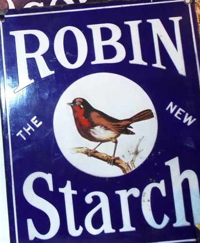
Lots of signs are boring, look at this sign, its just a boring common robin on a twig. You see them every time you look out of the kitchen window... Dull and boring as hell!
|
|
|
|
|
Ciggysigns
Tat Addict
Posts:848

|
| 15 Jan 2019 11:57 AM |
|
I’m with hinks on this , the H&P does zero for me .. it’s the man dressed in green which gives it a not v old uncomfortable look if that makes sense .. Now the robin starch is just SO much nicer , v appealing image , lovely sign . |
|
|
|
|
factory boy
Tat Addict
Posts:552
|
| 15 Jan 2019 12:29 PM |
|
Agree, much nicer. A Robin on a twig is indeed an exceptionally appealing image. It might even win the Turner prize? I'm not against men dressed in green clothing. I know a guy who lives in the west country who wears green tracky bottoms! |
|
|
|
|
hinkslamps
Tat Addict
Posts:837
|
| 15 Jan 2019 12:33 PM |
|
Yes I don't get the comparison with the Robin Starch sign. That one to me is infinitely more appealing/superior as a sign than the Ginger Nuts one. |
|
|
|
|
hinkslamps
Tat Addict
Posts:837
|
| 15 Jan 2019 12:37 PM |
|
It somehow has qualities inherent to aesthetically appealing signage (the Robin Starch) which are absent in the Ginger Nuts one.
And it's not anything to do with the subject of the illustrations - man/robin whatever. It's more to do with style of illustration - shape - layout - lettering. |
|
|
|
|
batleycarr1
Tat Addict
Posts:987

|
| 16 Jan 2019 10:30 AM |
|
Both are beautiful signs. The Robin looks Victorian in design. |
|
|
|
|
banjo boy
The Tatfather
Posts:6121
|
| 16 Jan 2019 03:02 PM |
|
The John Ginger in mint condition looks like a repro i reckon..OMO by thw way,,thats what puts me off the sign |
|
|
|
|